D&AD Brief: Monotype
Change For Trans Campaign, 2019.
New Blood Awards Winner 2019
"Language is often strongly engrained in the nature of a community from the language we speak to how and where we communicate. How could this translate across to typography becoming an identifier for community as well?
Create a typography-led integrated graphic design campaign that uses type to celebrate a community of your choice, showcases what makes it unique and explores communities beyond the usual expectations. Such as online communities, those with shared interests, groups trying to bring about change or even communities brought together by circumstance. It’s up to you."
–Monotype
Honours & Awards
D&AD New Blood Awards 2019 • Wooden Pencil
Background
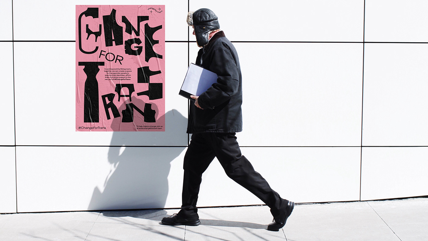
A dressing room is where everyone’s most trans-formational moments take place. It is an embodiment of trans-formation with every garment tried on. This desire to dress up and the way of self-expression is no different than that of a transgender individual’s.
The discrimination that the transgender community suffers run deeper than shopping. It is about the experience of occupying public spaces comfortably in general–something too many transgender people still do not have. Being denied access to public spaces just based on gender nonconformity is problematic. For those reasons, transgender people feel like second class citizens.
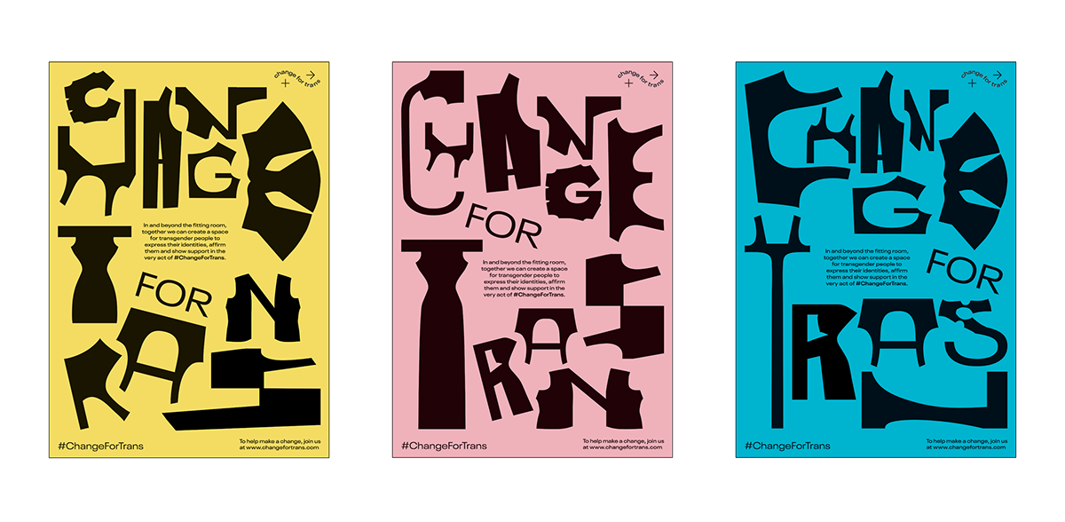
• Change For Trans Poster Series.
Concept
The Intimate Trans-formation Point
This campaign is made to unite people across the gender spectrum to strengthen acceptance towards the transgender community in and beyond clothing stores. It is an attempt to create a trans-friendly environment, giving them the recognition of gender fluidity and validate the freedom for transgender individuals to express their inner selves. There has been a lot of advancement in terms of media representation in the West, but it is still a work-in-progress in Singapore. Those traditional gender expectations can turn shopping into an uncomfortable and strained experience for transgender individuals.
Change For Trans aims to solve this by garnering support from two distinctive levels–from
a retail level and personal level, and communicating this expressive spirit of the community through
a dynamic typographic language.

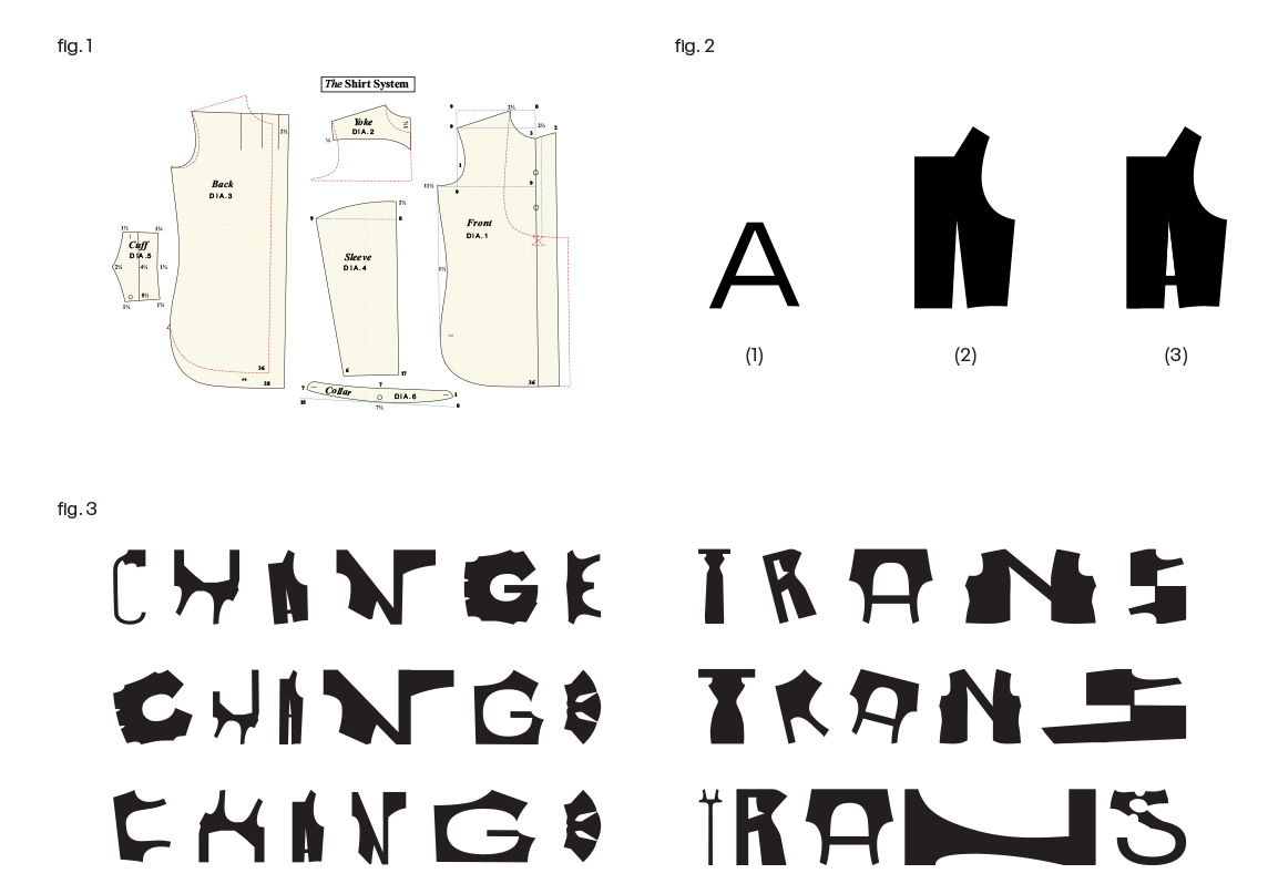
• Typeface Design Process:
fig. 1. We referenced a sans-serif typeface as a ‘type skeleton’.
fig. 2. Patterns created during pattern drafting serve as the foundation for the creation of different garments.
fig. 3. The patterns were abstracted and transformed into type, creating unique forms that ultimately reflect the spirit
of the transgender community.
Typeface Design
The idea for the design is derived from pattern drafting (fig.1), which is the foundation for apparel making. Similarly, acceptance towards the transgender community is also a work-in-progress, with different parts of the world progressing at varying levels.
Often trans has negative connotations to it, this campaign light-heartedly pairs vibrant colours and quirky type treatment to contrast something that is usually gloom.
The rawness of the type is used to highlight a simple desire of the transgender community–to wear clothes that reflect how they feel on the inside. Just as these patterns are pieces of a larger whole (fig.3), the transgender community is part of the fabric of our society and deserves to be able to live their truth.

Touchpoints
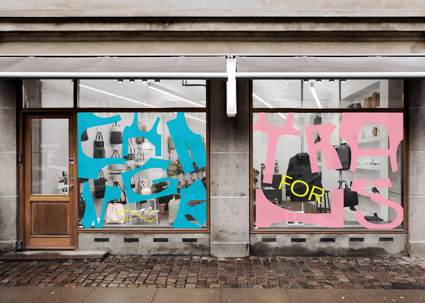
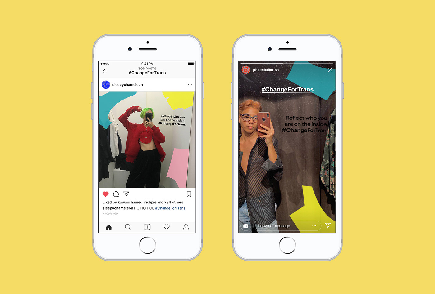
On a retail level, store owners can register their store, pledge their support as a trans-friendly space and be located on a map across the world. Store decals with Change For Trans can also be seen on storefronts. On a personal level, an individual can be an ally by spreading the word and share #ChangeForTrans, it helps to humanize the issue and show support to transgender community.
This is more than a flash-in-the-pan campaign, Change For Trans celebrates the quirky and dynamic spirit of the community. It is an eradication to the defining gender definitions that govern so much of life. It is one modest step closer to change. It is a signal to the transgender community; that in a future not too far away, they can feel safe, comfortable and welcomed in public spaces.
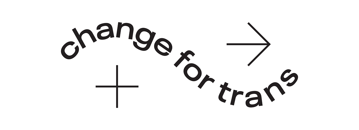
• Change For Trans official logo.
Change For Trans logo is a mix of symbols and type.
The graphics are extracted from the gender symbols, making the logo less heavy and obvious as
a gender campaign. Additionally, the plus symbol indicates optimism while the arrow symbol
shows direction and progressiveness.


• Change For Trans official website.
• UI/UX Presentation Video.
As part of our submission for the D&AD New Blood Awards 2019, we created a presentation video
to explain the campaign and show how the website works.
Team Credits
Claudia Tan
Nguyen Vuong Cam Tu
Fahmi Sedek
Fuli Gao
Spread the love to all humans!
Cheers!


